To design a fresh new approach for a startup SaaS business within the fitness industry. The challenge presents in being trust-worthy and professional with a seamless user experience unlike it’s competitors.
An application designed to help personal trainers connect with potential clients.
The app allows PT’s to create a profile with information about their qualifications, specialties, and availability. Trainers can expand their client base and streamline their business operations, while clients can find a trainer that fits their needs and schedule sessions conveniently.
Clients can search for trainers based on their location, fitness goals, and other criteria while the app also provides a list of recommended trainers based on the client's preferences. Once a client has found a trainer they are interested in working with, they can book them directly through the app with a payment processor to make paying for sessions easier and faster.
Challenge
Solution!
To create clear and aesthetically pleasing user profile screens while offering a streamlined UX with real-time data updates all in one place. The app differentiates itself by being very simple with the very basic features required, ultimately creating a valuable platform for personalised fitness training.
Project Brief
Project Overview: The Personal Trainer Finder App is a web application designed to connect fitness enthusiasts with qualified personal trainers. The app aims to streamline the process of finding and booking trainers, promoting a healthy lifestyle, and providing users with personalised fitness guidance.
Timeline and Milestones:
- App Design and Wireframing: 2 weeks
- Frontend and Backend Development: 8 weeks
- Testing and Bug Fixing: 2 weeks
- Launch and Marketing: 2 weeks
Legal and Regulatory Considerations: The app development and operations will comply with all applicable laws and regulations concerning fitness services, data protection, and privacy.
Monetisation Strategy: The app will adopt a subscription-based revenue model, charging a recurring fixed fee for personal trainers looking to list themselves on the application.
Key Features:
- Personal Trainer Profile: Users can create accounts, and set up personal profiles with pictures and a bio. Specifying their fitness skills, qualifications, and location.
- Trainer Listings: The app will display a comprehensive list of verified personal trainers, along with their credentials, specialties, and ratings.
- Matching Filters: Filters will match users with the most suitable trainers based on their fitness objectives and location preferences.
- Booking: Users schedule appointments conveniently within the app via email.
- Trainer Reviews and Ratings: Users can provide feedback and ratings for trainers, helping others make informed decisions.
- Trainer Profile Management: Trainers can update their profiles in real-time, availability, and specialties to attract potential clients effectively.
Target Audience: The primary target audience for the app includes fitness enthusiasts, individuals seeking personalised fitness training, and those looking to achieve specific health and wellness goals. The app will also cater to professional personal trainers seeking to expand their client base and offer their expertise.

Research?
LET'S
DESIGN


Design Choices
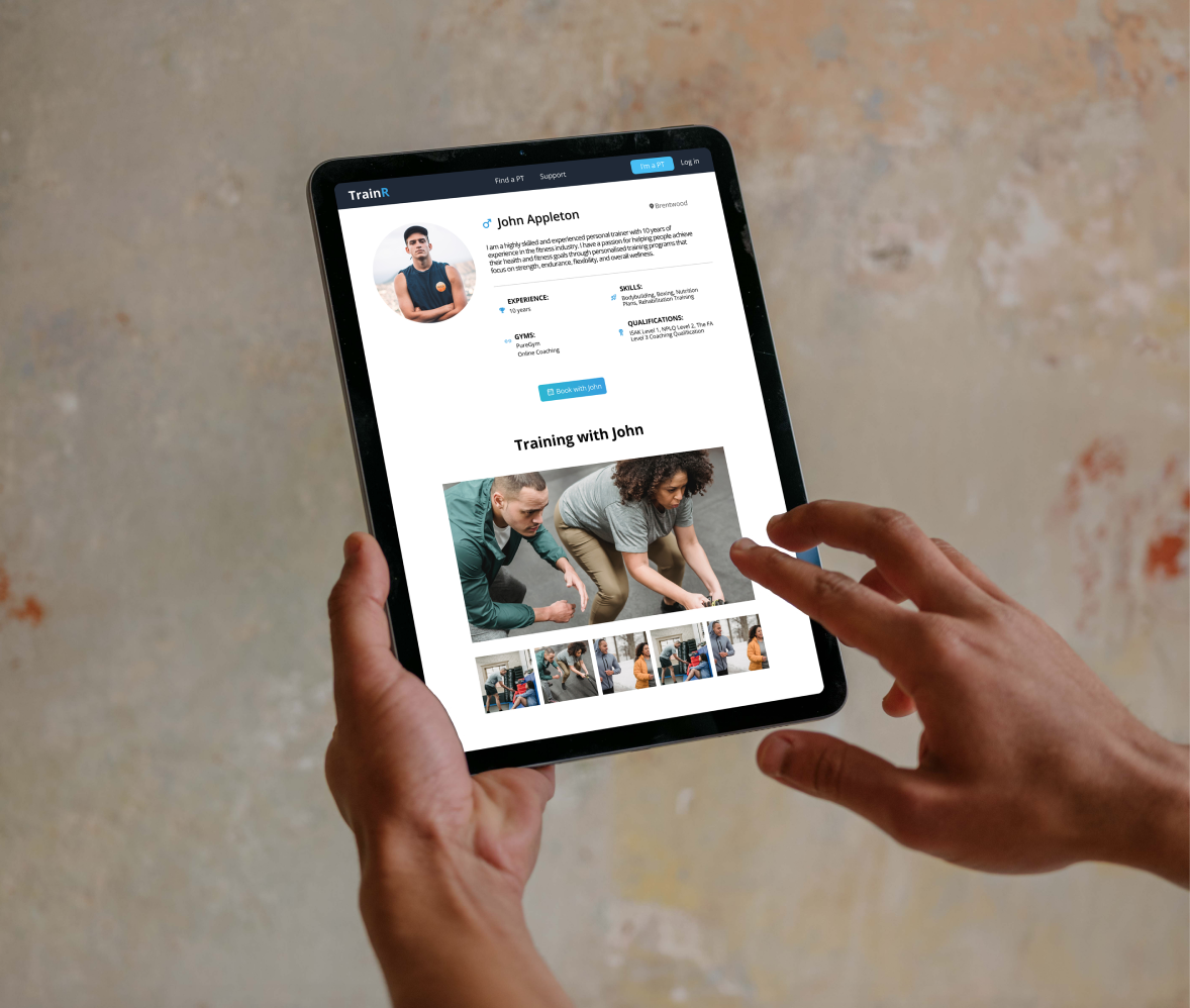
My client provided me with a sample card layout they roughly wanted for the profiles. With this I was able to use my research and gathered the information needed for the profile page. Copy-write was discussed throughout the whole project to ensure everyones opinions were heard and applied in best practise.
Above the fold remain all the important parts of the design of the profiles, including bio, experience, and qualification. This visual hierarchy is important to catch the viewer’s eyes and guide them to the call of action button point. Below the fold are some imagery and testimonials for the PT’s. This is extremely important to gain trust and support the user through their journey in case they feel uncertain. Again we follow through with another call to action button at the very end of the page as a visual cue and remind the user to click.
- I noticed Apple do this a lot throughout their website with “buy” buttons on every viewpoint when scrolling the page to control the user.
Colour Theory
- Blue represents reliability, cleanliness, and trust and is associated with calmness.
- Dark blue is associated with intelligence, reassurance and trust and is a preferred colour for large corporations.
- Orange says optimism, confidence, enthusiasm, warmth, and agreeableness. This was used as the complementary colour to add excitement to the marketing campaigns as just blue lacked the drive to convert.
Font
Currently, the app only uses 1 font and that is “Open Sans” – Open Sans is available via an open-source license and can be used commercially. While the app is still very fresh and new with a lot more design iteration to come, my client decided on leaving this design aspect until the app is more readily available with a larger pool of users to a/b test with.
Marketing Landing Page
- Powerful marketing call to action
- Visual hierarchy
- Messaging focused on the end-user.
- On brand design system

This landing page was designed by myself in Figma which was then coded by my client.
(The name of this product was later changed to TrainAmp.)
The page is simple, and to the point and doesn’t make the user think too much about their actions. My client had a previous landing page that was clogged with words, and content and it was extremely data-heavy which we could see the users dropping off. This data gained us insight into what needed to be done – and it lacked the movement of being straight to the point which was my main focus.
The flow of this landing page goes through the motion of what a user would be thinking when they’ve landed on it:
- What is this landing page trying to tell me? The opening fold has a clear message of what the app is along with a SC of the app in action and why you should join with a power orange call to action button.
- What does it do? As we begin to scroll we come to an overview of the features and questions the user may have begun to ask themselves while reading the heading. This instills positive thoughts as the user feels like they are being listened to and heard with their queries.
- I need more information. From this feature list, we land on a FAQ drop-down section which answers a few more technical questions that weren’t previously answered – gaining the user’s trust and confidence in the app.
- Where do I sign up! Finally, the last call to action button to finish off the landing page is the deal sealer. This was simplified and made to look like a ticket card to entice the customer to “pick” up the card and go to check out in literal terms. (The CTA is a direct link to the sign-up process where they input their card details.)
- As we scroll a sticky call to action button follows the user, with a warm and inviting orange button- making it very irresistible to click.